Forge
Forge
Forge
Hawai'i Public Housing Authority
Hawai'i Public Housing Authority
Hawai'i Public Housing Authority
Overview
Overview
Overview
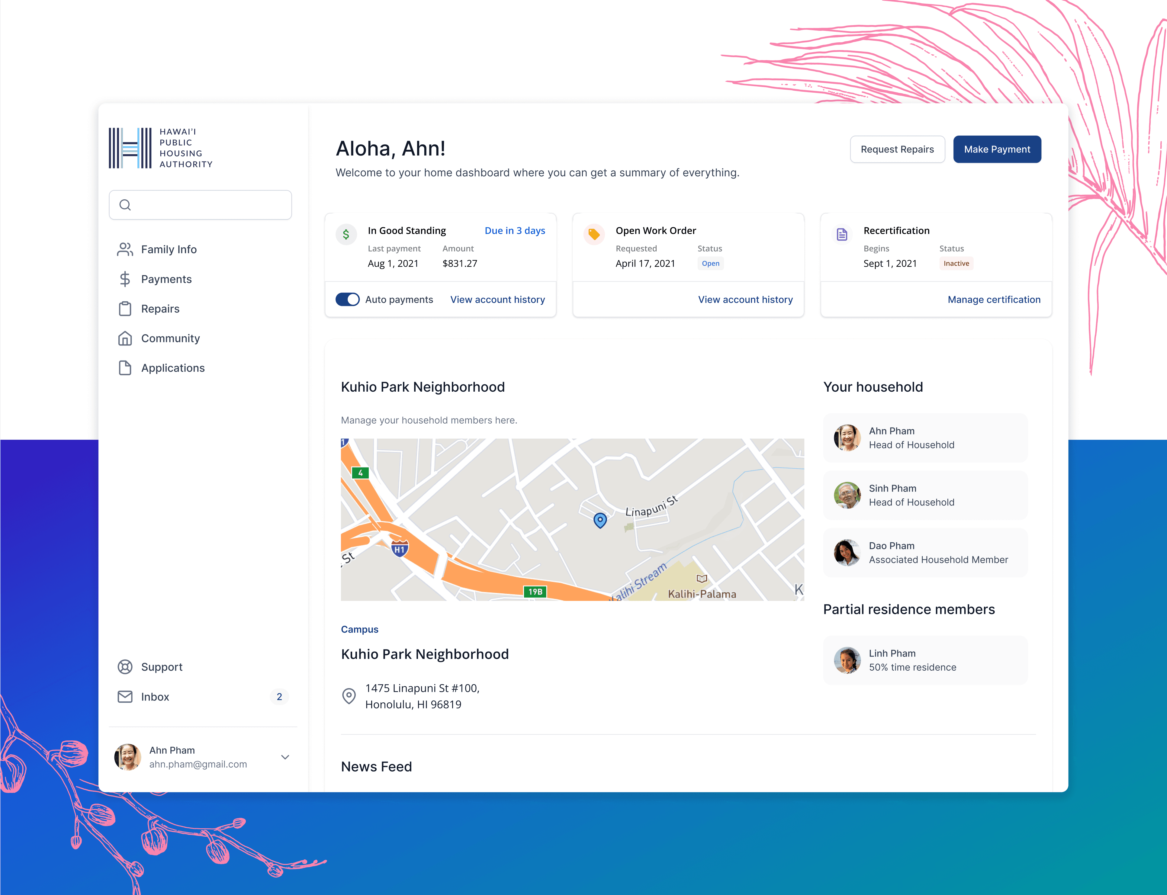
Forge created detailed designs of a modern public housing management solution. These designs were compiled into a Request for Proposal for HPHA as they sought to update their public housing management software to better serve the administrative offices, applicants, and residents.
Forge also worked with The University of Hawaiʻi Community Design Center (UHCD) on the Re-Imagining HPHA Series to redesign HPHA's website, increasing the accessibility of critical digital tools and information for the many residents that HPHA serves.
The Re-Imagining HPHA Series is “multidisciplinary initiative … aimed at re-thinking public housing programs and facilities in an effort to support HPHA’s mission and long term goals.” You can see the updated website and read more about UHCD and their work, along with the Hawai'i Housing Lab and the University of Hawaiʻi at Mānoa, in the article below.
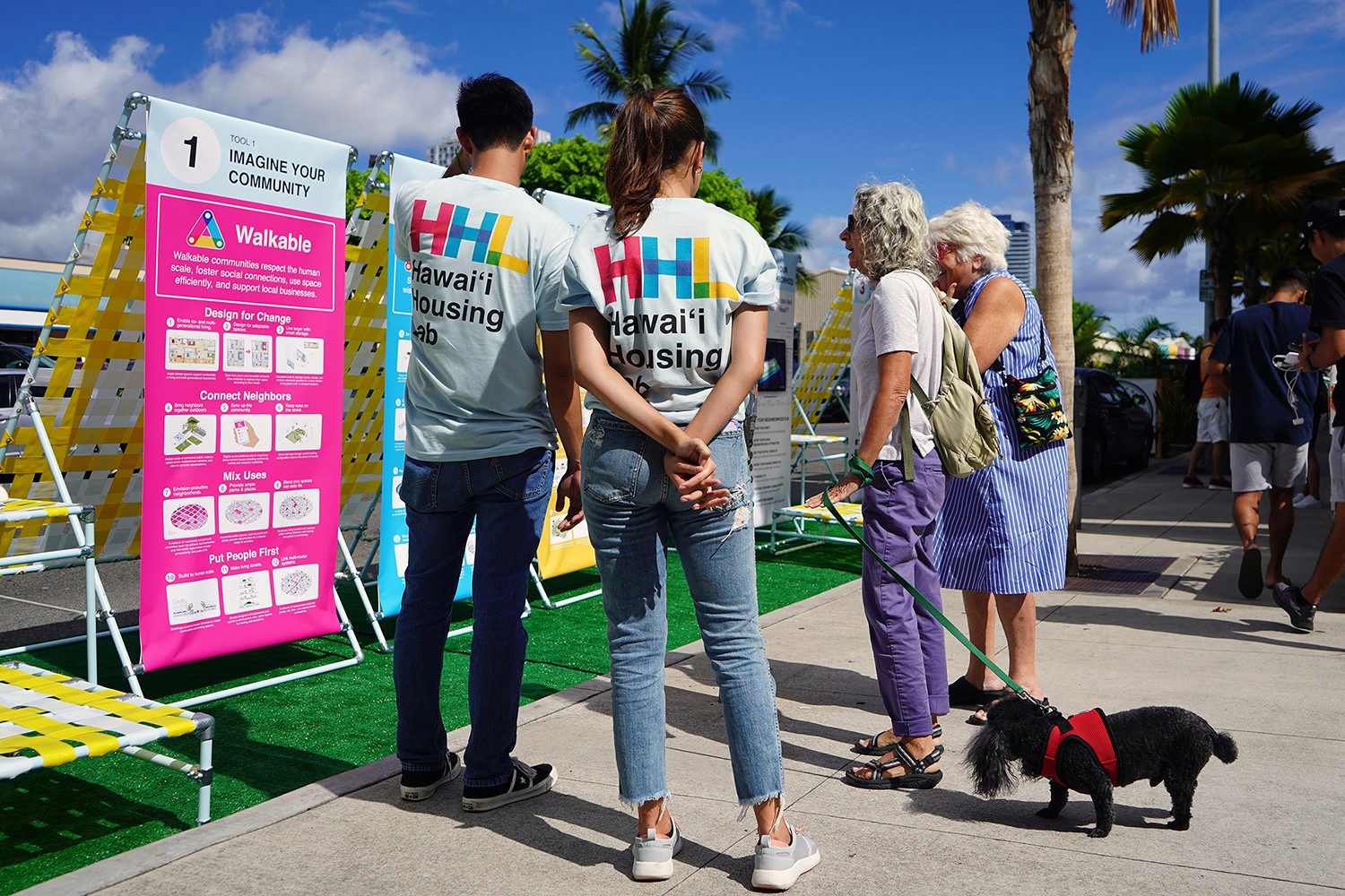

Housing Authority & University Partnerships are a Win-Win
Housing Authority & University Partnerships are a Win-Win
Housing Authority & University Partnerships are a Win-Win
Problem
Problem
Problem
The HPHA was operating in a legacy system that was outdated and bloated in functionality. It was a large time expense to train new employees on this system, and a barrier to working efficiently in a high-demand environment.
The HPHA was operating in a legacy system that was outdated and bloated in functionality. It was a large time expense to train new employees on this system, and a barrier to working efficiently in a high-demand environment.
The HPHA was operating in a legacy system that was outdated and bloated in functionality. It was a large time expense to train new employees on this system, and a barrier to working efficiently in a high-demand environment.
Solution
Solution
Solution
Forge would provide high-fidelity designs of a future platform, based on extensive knowledge and research of the current system architecture, employee interviews, and general SaaS best practices.
Forge would provide high-fidelity designs of a future platform, based on extensive knowledge and research of the current system architecture, employee interviews, and general SaaS best practices.
Forge would provide high-fidelity designs of a future platform, based on extensive knowledge and research of the current system architecture, employee interviews, and general SaaS best practices.
My role
Product Designer
My contributions
Interface Design
Stakeholder Presentations
Market research
User interviews
The team
Myself
Product Design Lead
Product Designers
UX Researcher
Project Manager
Timeline
Sept 2021 - Feb 2022
My role
My role
My role
Design Lead
Product Designer
Design Lead
Year
Timeline
Timeline
Q2 2022 - Q4 2023
Sept 2021 - Feb 2022
Q2 2022 - Q4 2023
My contributions
My contributions
My contributions
Design iterations
Prototyping
Client demos
User + market research
User interviews
Post-deployment QA
Interface Design
Stakeholder Presentations
Market research
User interviews
Interface Design
Prototyping
Client demos
User + market research
User interviews
Post-deployment QA
The team
The team
The team
Myself
Product Designer
Product Manager
Front End Engineering
Myself
Product Design Lead
Product Designers
UX Researcher
Project Manager
Myself
Product Designer
Product Manager
Front End Engineering
Get rid of the noise
Get rid of the noise
Get rid of the noise
The software that was being used by the HPHA admin team to file and track applications, as well as manage current residents, was an outdated and feature-bloated monstrosity. It was a legacy system that did not seem to obfuscate any functionality from the user. Since it was used by many other housing authorities, it appeared to operate in a one-size-fits-all all fashion. The first step to understanding how the admin team was working, was to understand what exactly was present in the current system. I accomplished this by analyzing videos of user interviews, where different admin employees walked our researcher through their different tasks within the system. These videos, along with a few additional interview sessions to clarify confusing points, was used to create a detailed map of the system architecture.
The software that was being used by the HPHA admin team to file and track applications, as well as manage current residents, was an outdated and feature-bloated monstrosity. It was a legacy system that did not seem to obfuscate any functionality from the user. Since it was used by many other housing authorities, it appeared to operate in a one-size-fits-all all fashion. The first step to understanding how the admin team was working, was to understand what exactly was present in the current system. I accomplished this by analyzing videos of user interviews, where different admin employees walked our researcher through their different tasks within the system. These videos, along with a few additional interview sessions to clarify confusing points, was used to create a detailed map of the system architecture.
The software that was being used by the HPHA admin team to file and track applications, as well as manage current residents, was an outdated and feature-bloated monstrosity. It was a legacy system that did not seem to obfuscate any functionality from the user. Since it was used by many other housing authorities, it appeared to operate in a one-size-fits-all all fashion. The first step to understanding how the admin team was working, was to understand what exactly was present in the current system. I accomplished this by analyzing videos of user interviews, where different admin employees walked our researcher through their different tasks within the system. These videos, along with a few additional interview sessions to clarify confusing points, was used to create a detailed map of the system architecture.
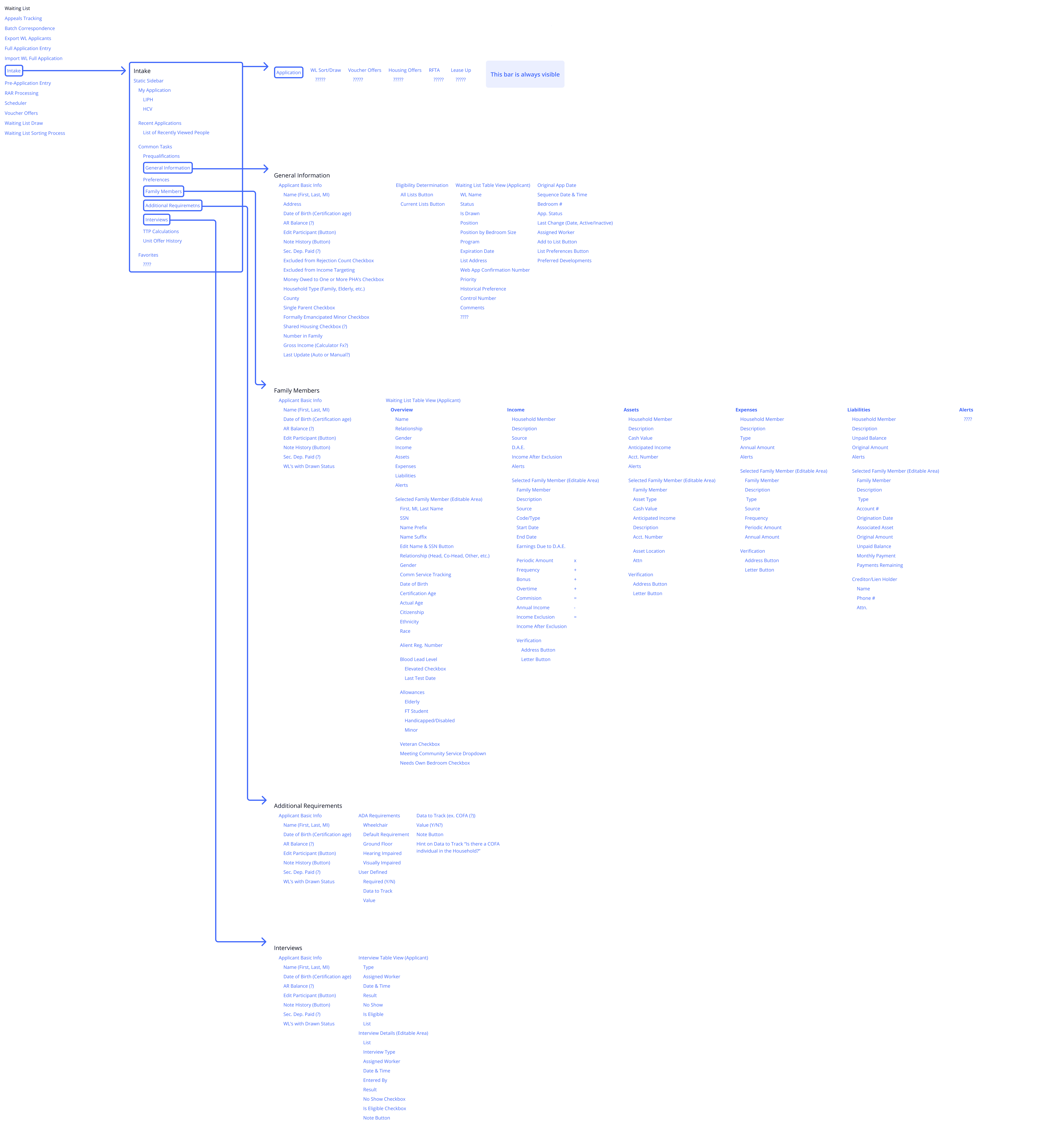


After I had mapped out as much of their system as I could without direct access to it, I was able to take this back into more interviews to determine what functionality within this architecture was used, who used it, and what jobs those functions accomplished. This information then gave me a basic understanding of what functionality I would need to include in the designs, and what could be trimmed out.
After I had mapped out as much of their system as I could without direct access to it, I was able to take this back into more interviews to determine what functionality within this architecture was used, who used it, and what jobs those functions accomplished. This information then gave me a basic understanding of what functionality I would need to include in the designs, and what could be trimmed out.
After I had mapped out as much of their system as I could without direct access to it, I was able to take this back into more interviews to determine what functionality within this architecture was used, who used it, and what jobs those functions accomplished. This information then gave me a basic understanding of what functionality I would need to include in the designs, and what could be trimmed out.
Creating understanding internally
Creating understanding internally
Creating understanding internally
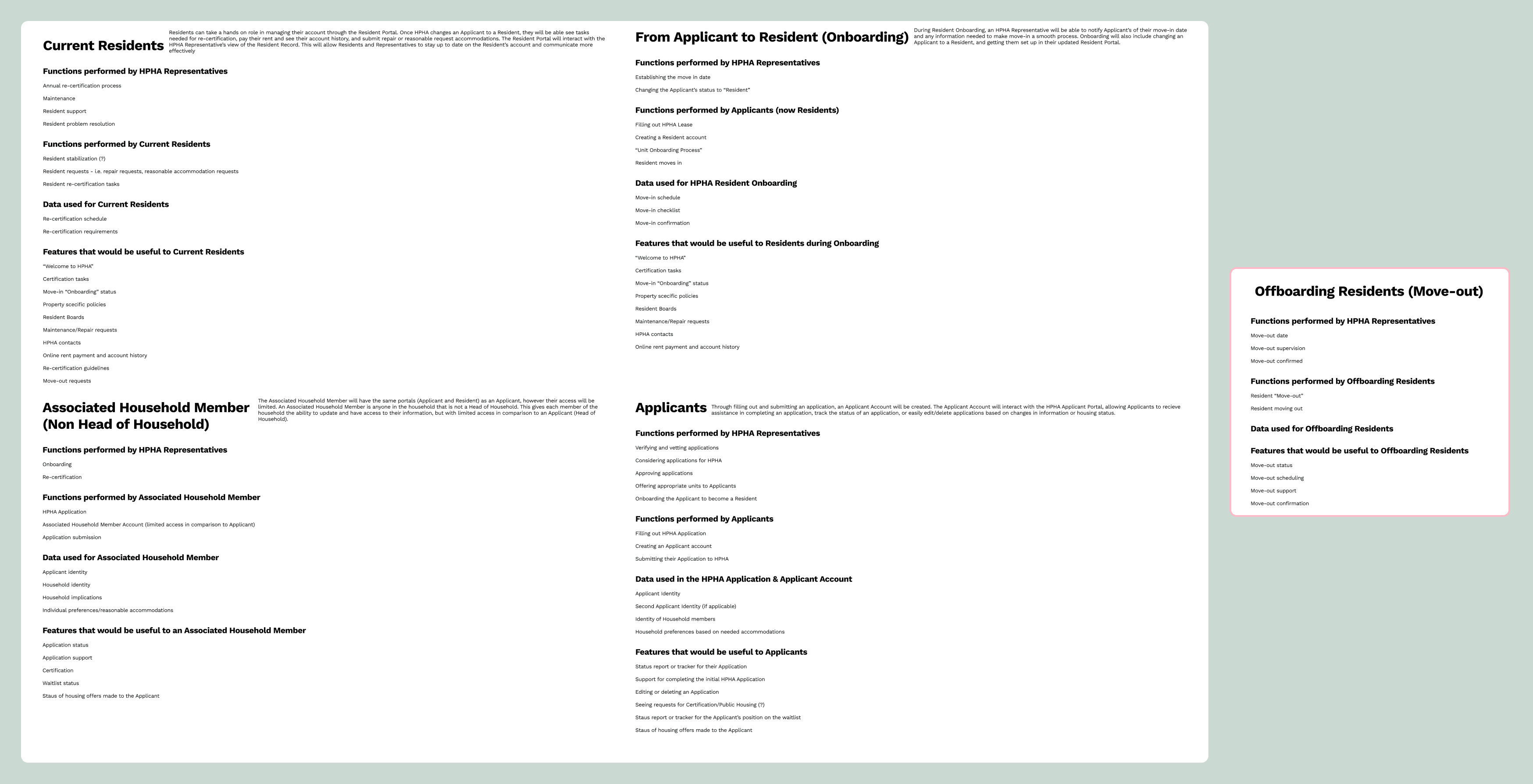
While the information gathered above was pivotal, I still needed to understand the inner workings of HPHA, what the various jobs were, and how applicants and residents factored into the picture. The current system only accounted for employee tasks and functions, but this new system would serve all HPHA admin, as well as applicants and residents. Since there were many separate functions within HPHA that did not necessarily interact, It was vital that we uncover how each of these roles interacted through the life cycle of a resident applying for housing assistance.
I was able to collect data from their current system, as well from watching recorded interviews with HPHA admin to list out my understanding of the jobs-to-be-done based on the different user personas that would be interacting with HPHA, both internal and external.
Facilitating understanding externally
Facilitating understanding externally
Facilitating understanding externally
Since the information gathered was in a jobs-to-be-done format, it could then be transformed into a complete user journey. This took several rounds of grouping data, confirming accuracy, and refining the flow, before we landed on a beautiful user journey flow that was able to show both the HPHA user journey flow as well as an applicant.
When we presented this to the our stakeholders within the HPHA admin team, they were blown away at how well this summarized all the jobs to be done in harmony with one another. This not only created clarity for the Forge team, but for the HPHA team as well, and would end up being used to explain the application process to new employees in their onboarding.


Design iterations
Design iterations
Design iterations
Now armed with the knowledge of exactly how the application process worked, we were able to start imagining what a system would look like from many different user perspectives.
Now armed with the knowledge of exactly how the application process worked, we were able to start imagining what a system would look like from many different user perspectives.
Now armed with the knowledge of exactly how the application process worked, we were able to start imagining what a system would look like from many different user perspectives.
Big picture first
Big picture first
Big picture first
We started by painting in broad strokes. We had a good idea of basic screens we would need to communicate our direction with our HPHA stakeholders and put those into low-fidelity wireframes so that we could start the conversation.
We started by painting in broad strokes. We had a good idea of basic screens we would need to communicate our direction with our HPHA stakeholders and put those into low-fidelity wireframes so that we could start the conversation.
We started by painting in broad strokes. We had a good idea of basic screens we would need to communicate our direction with our HPHA stakeholders and put those into low-fidelity wireframes so that we could start the conversation.
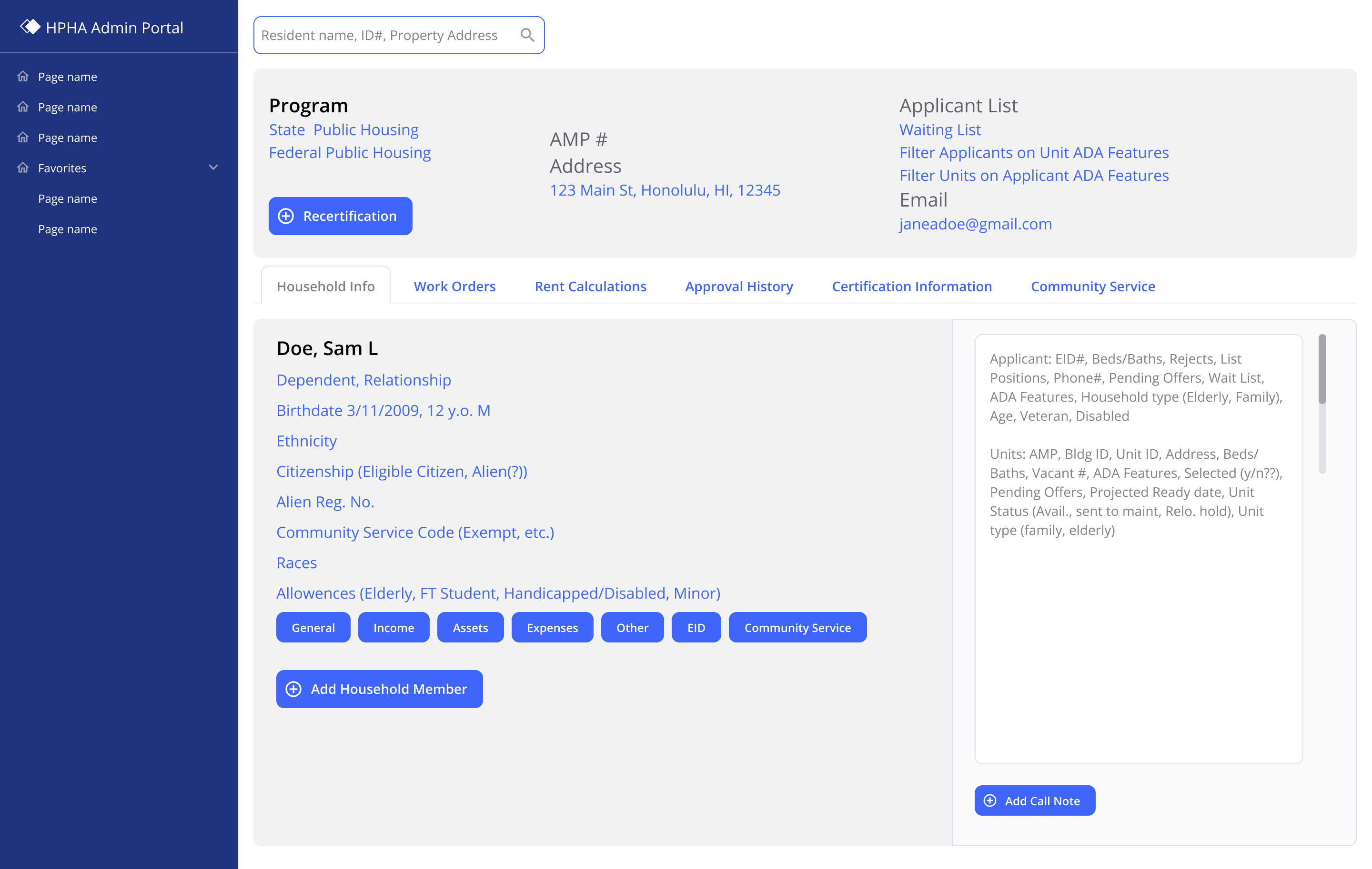


Household member information
Household member information
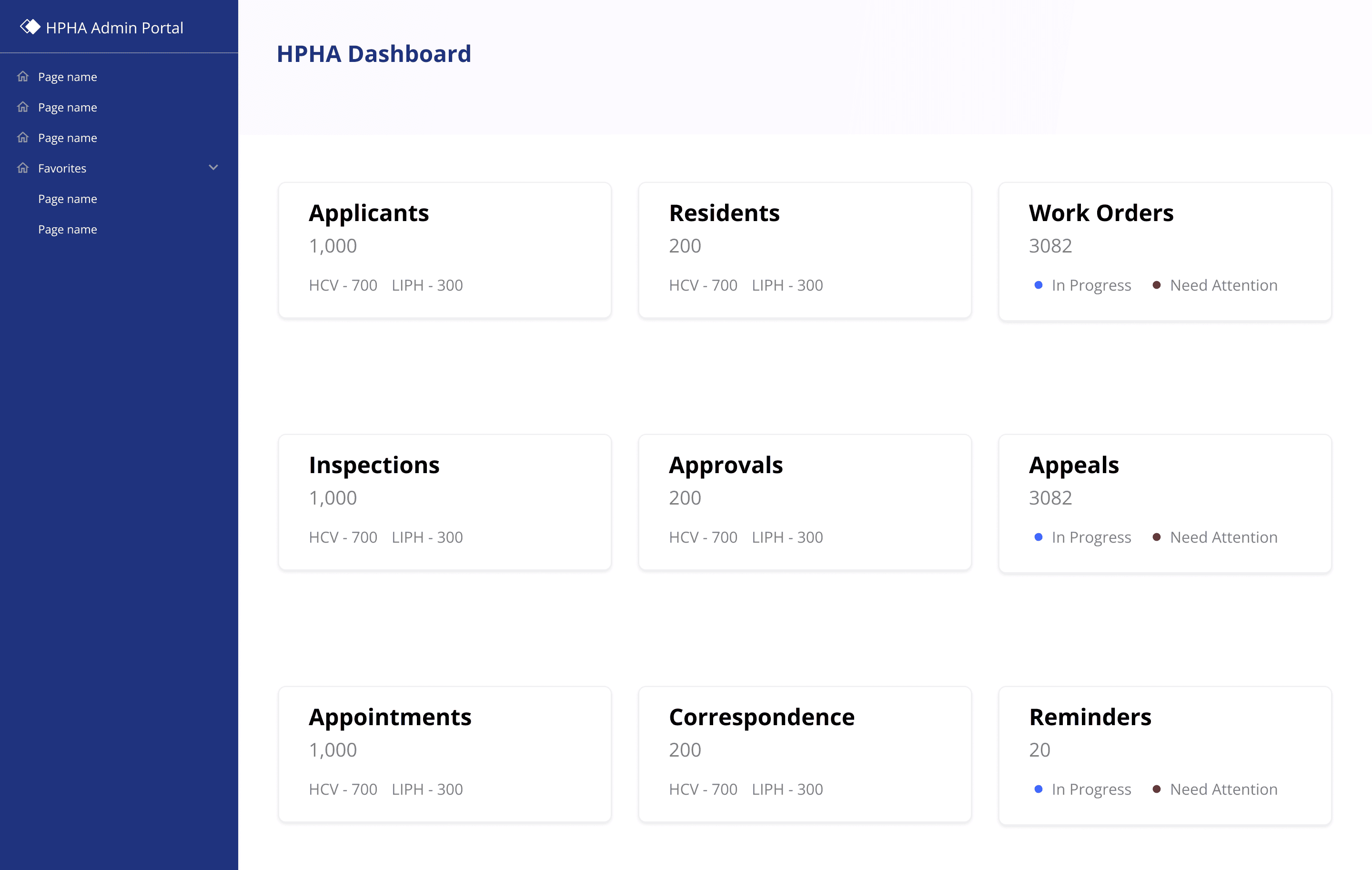


HPHA admin dashboard
HPHA admin dashboard
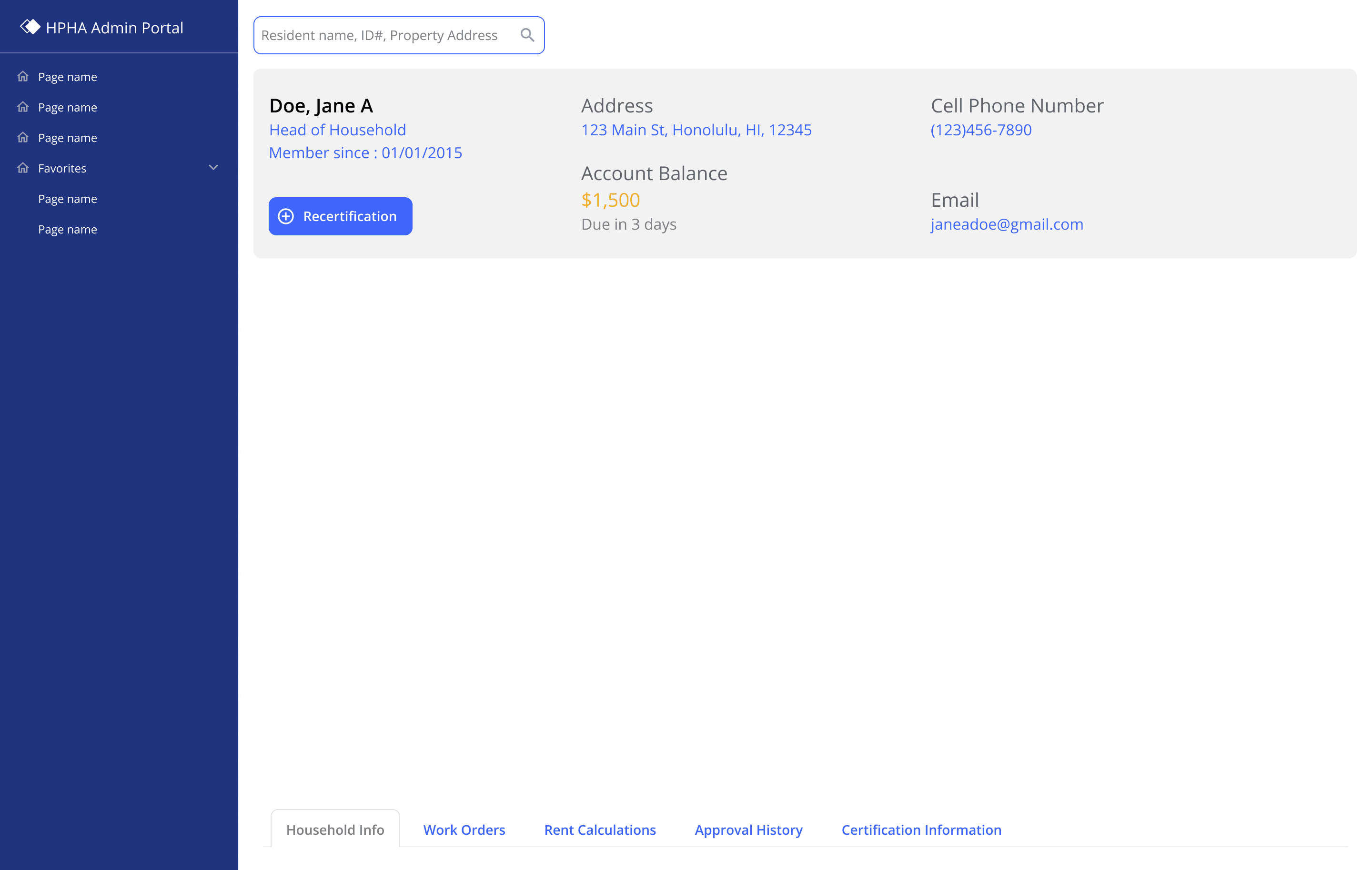


HPHA resident record
HPHA resident record
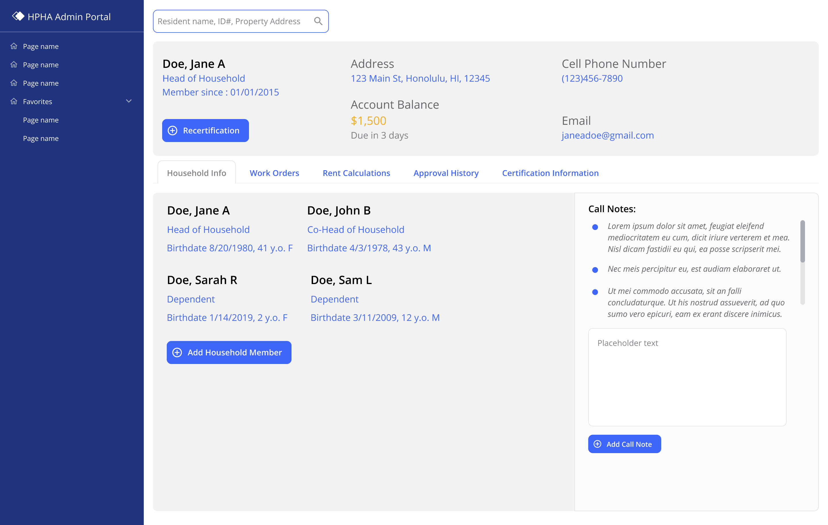


Resident record household information
Resident record household information
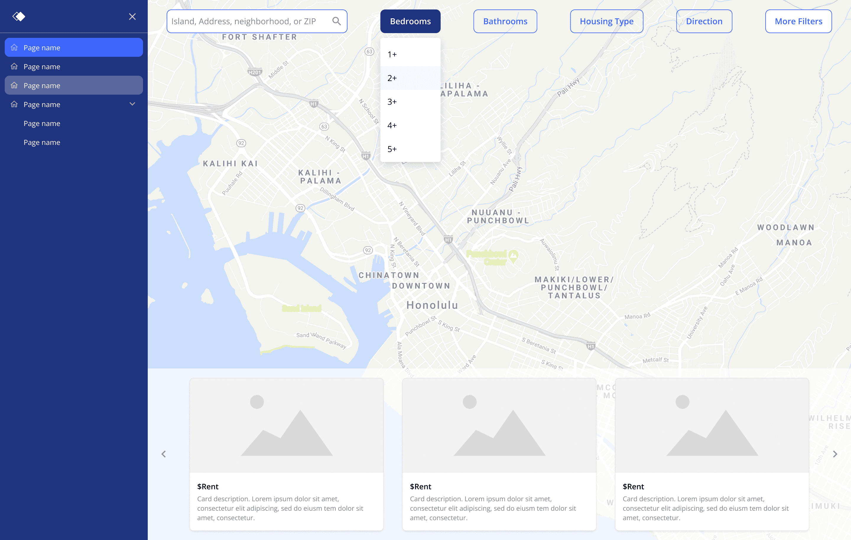


Applicant property search
Applicant property search
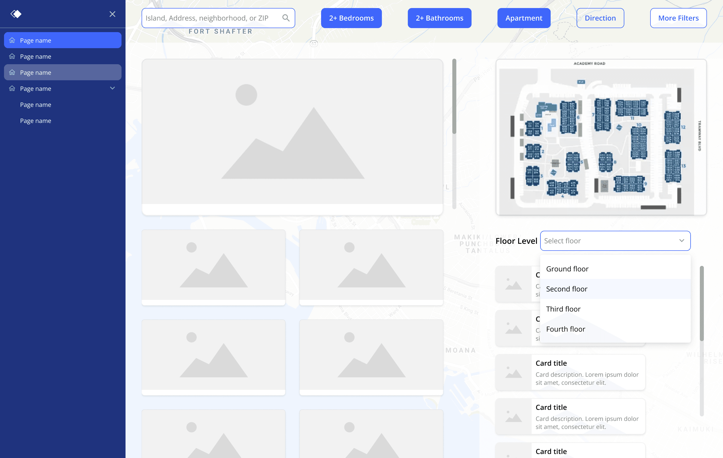


Applicant property search
Applicant property search
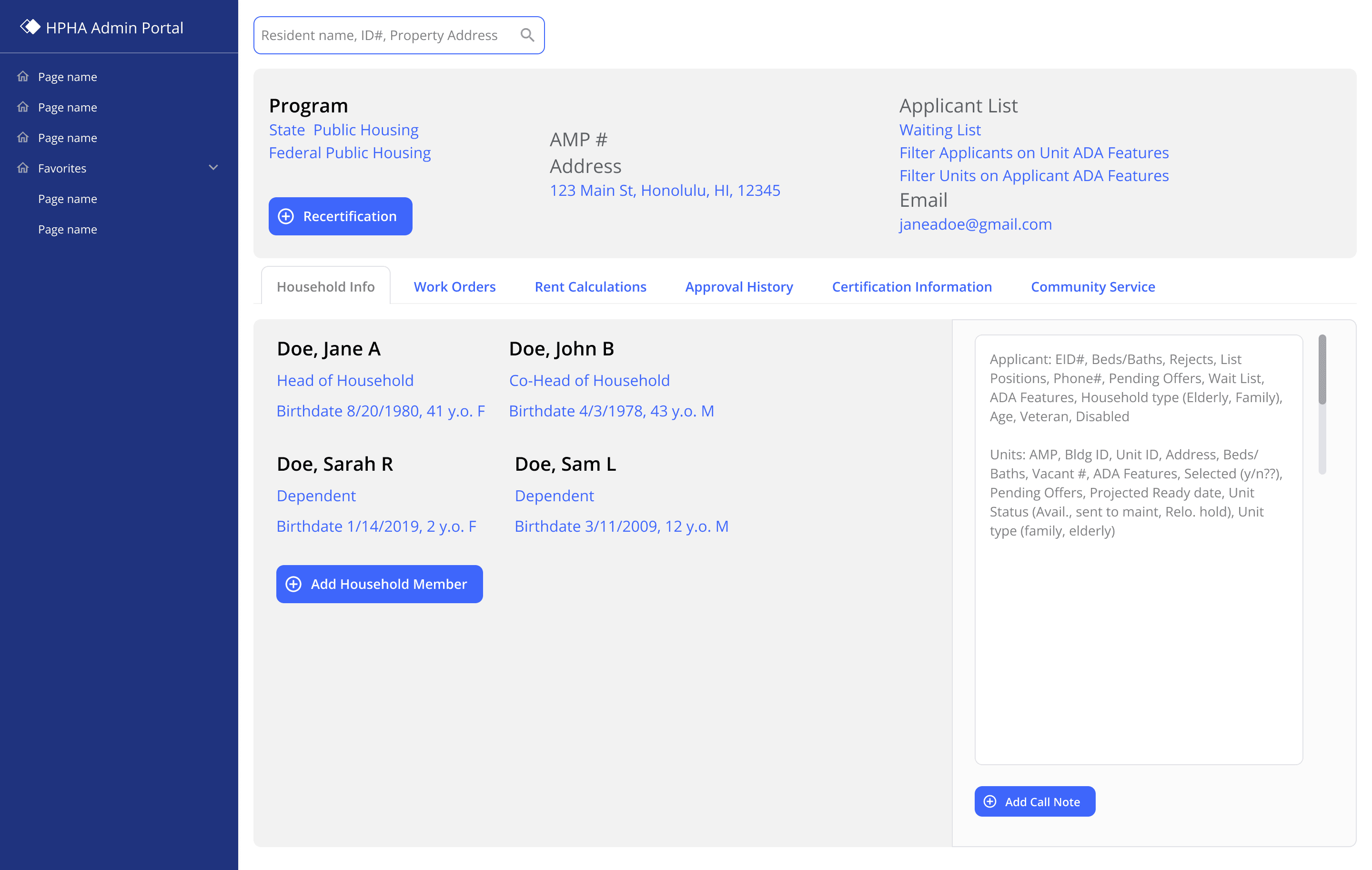


Waitlist intake
Waitlist intake


Applicant property search
Refine and get specific
Refine and get specific
Refine and get specific
Being able to speak to stakeholders with assets that clearly show the concepts you are trying to drive forward is instrumental to making sure everyone is on the same page, however, it can also cause confusion in data and information-rich environments when the information they are seeing is not accurate to the information they work with.
We noticed a need for accurate information without jeopardizing any of the resident's or applicants' real personally identifiable information. We did this by collecting all the data points that HPHA would normally have on an applicant or resident record, and created an extensive spreadsheet of fake data that we would use to make realistic resident and applicant records. This significantly improved our conversations, as stakeholders were no longer distracted by misleading information, and our designs could truly and accurately account for system information.
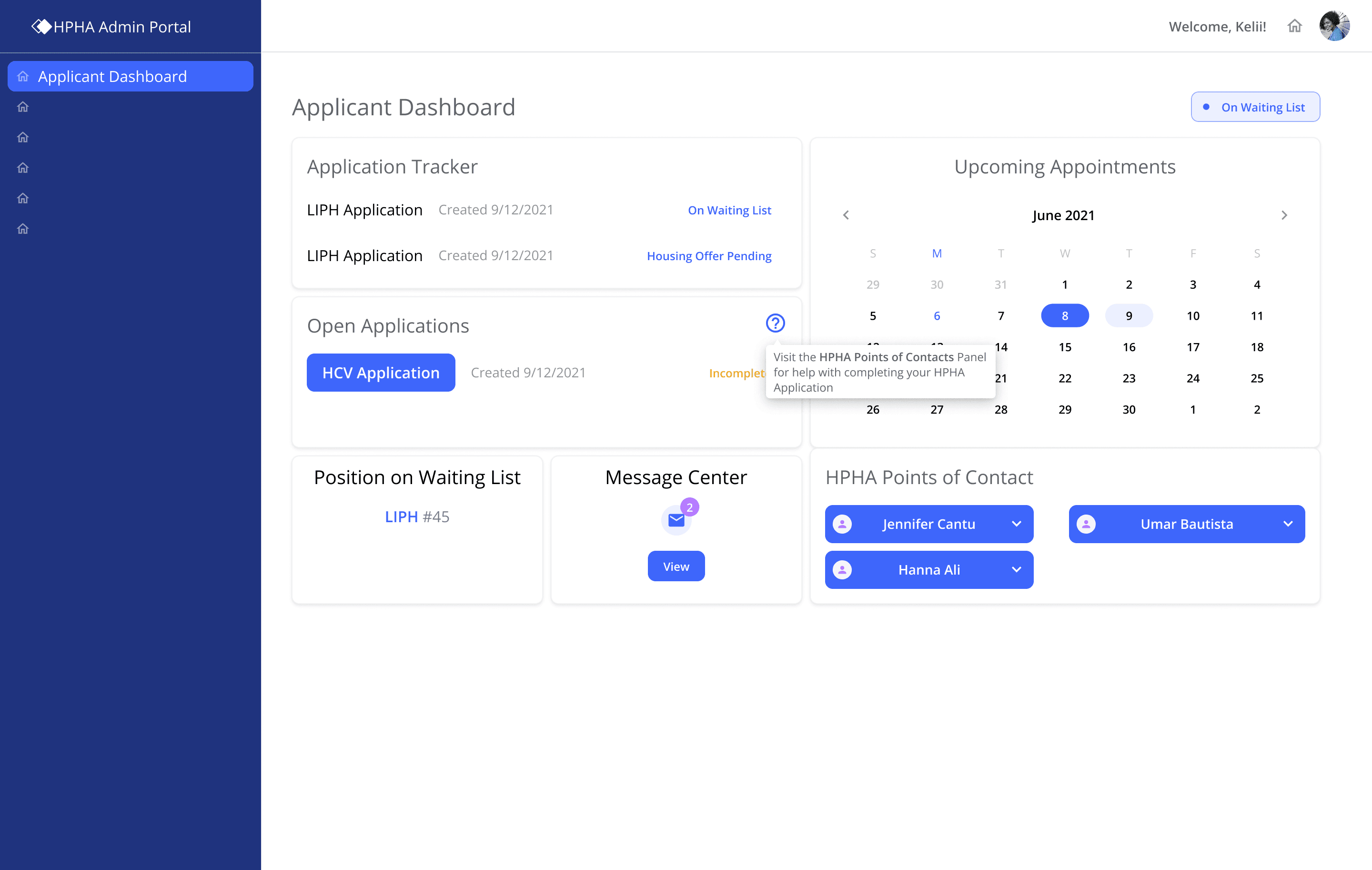


Applicant dashboard
Applicant dashboard
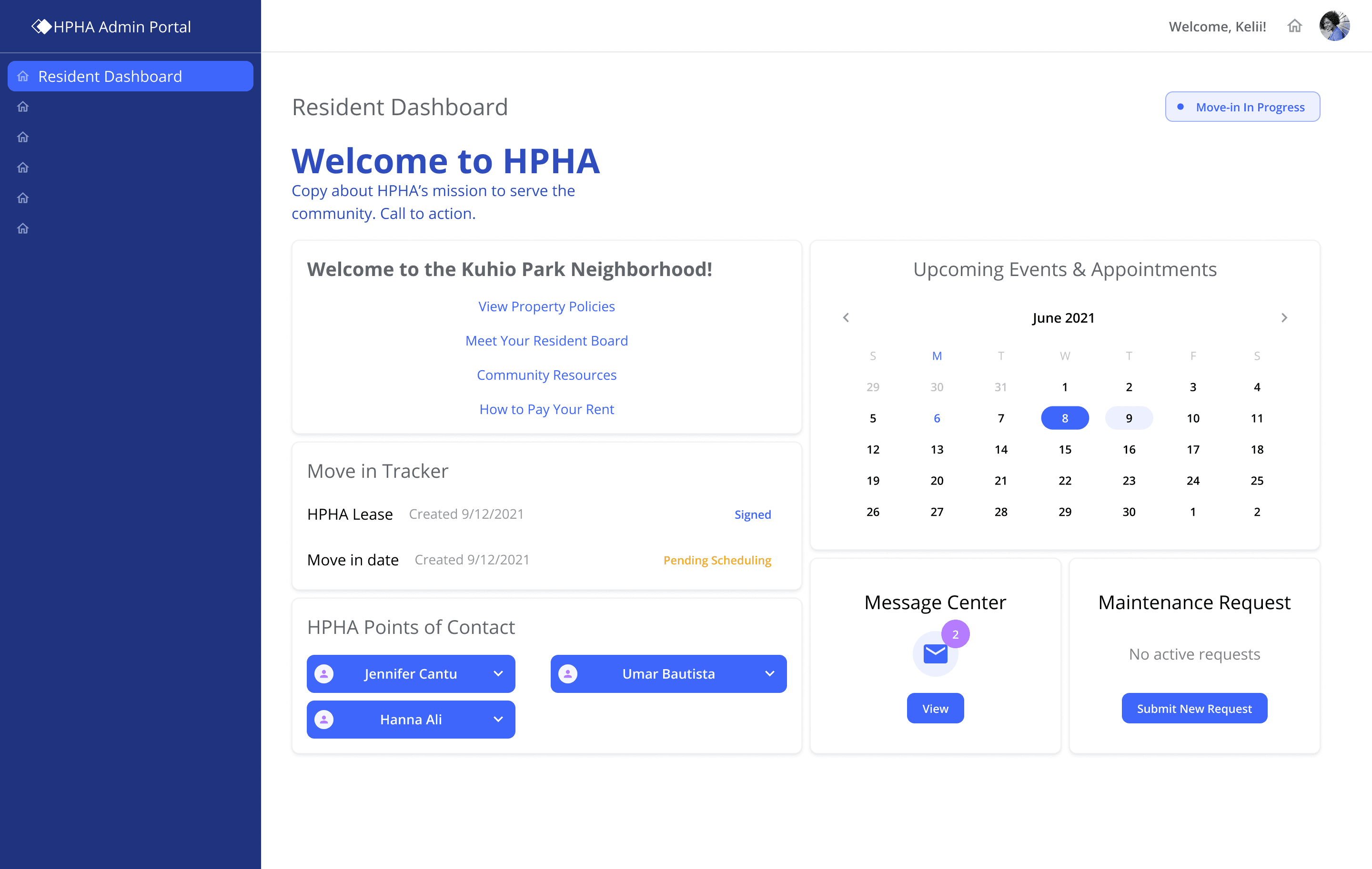


Resident dashboard - onboarding
Resident dashboard - onboarding
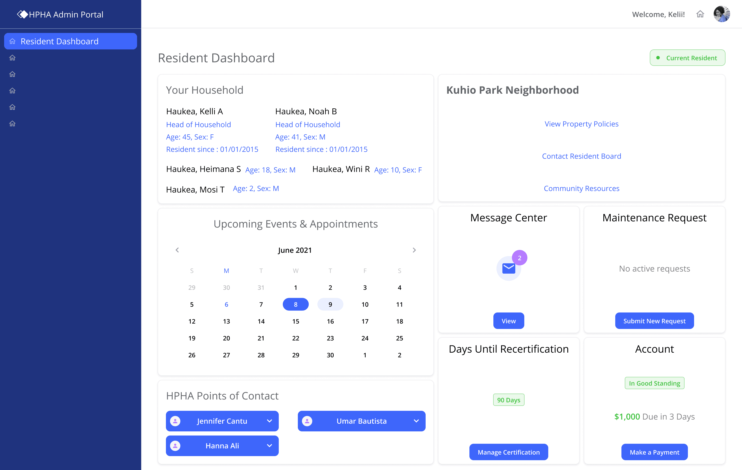


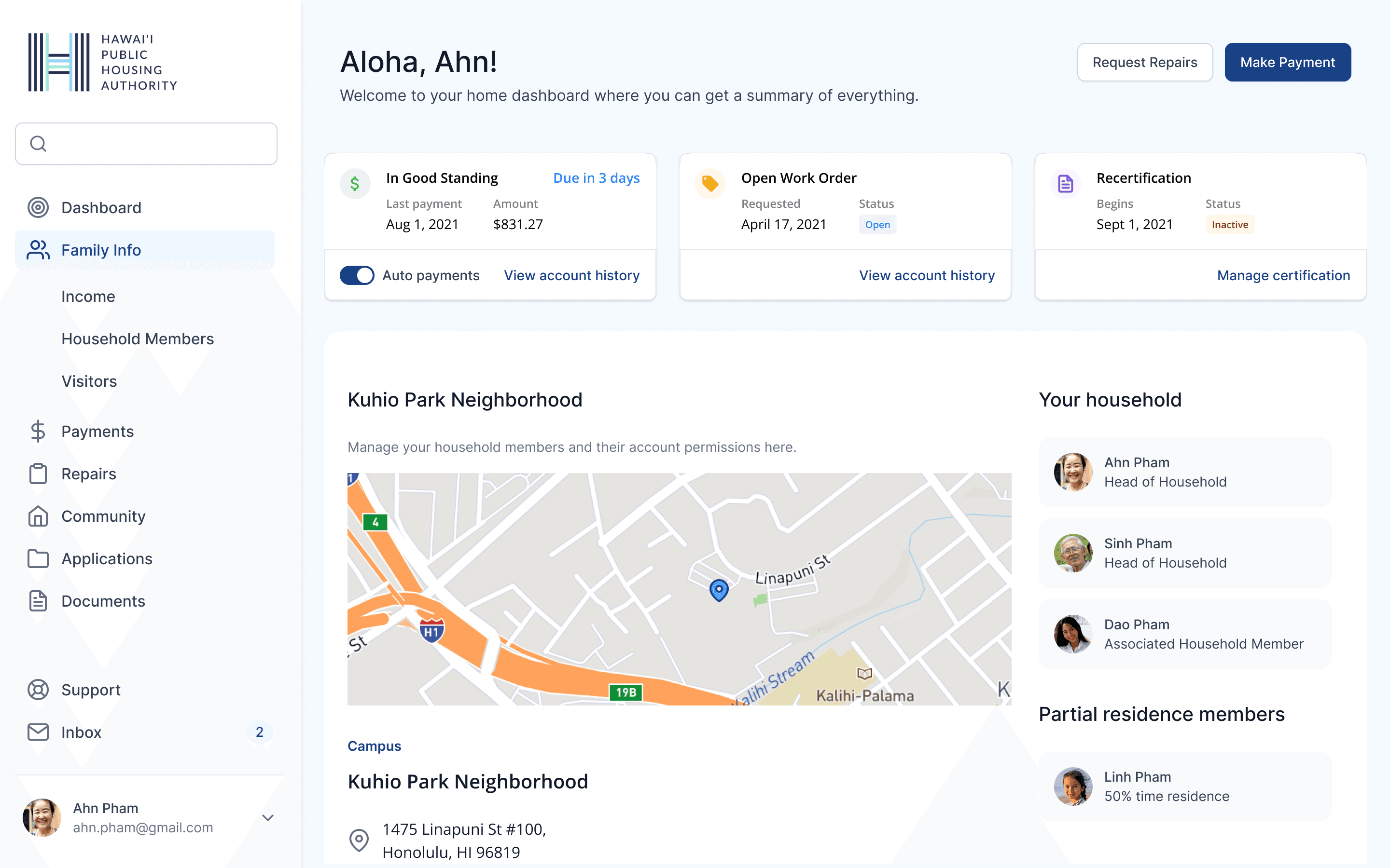
Resident dashboard
Resident dashboard
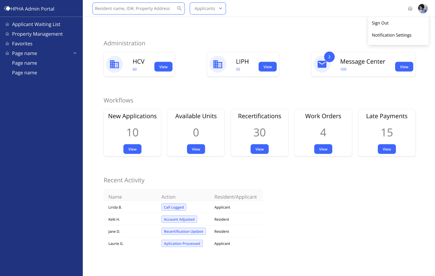


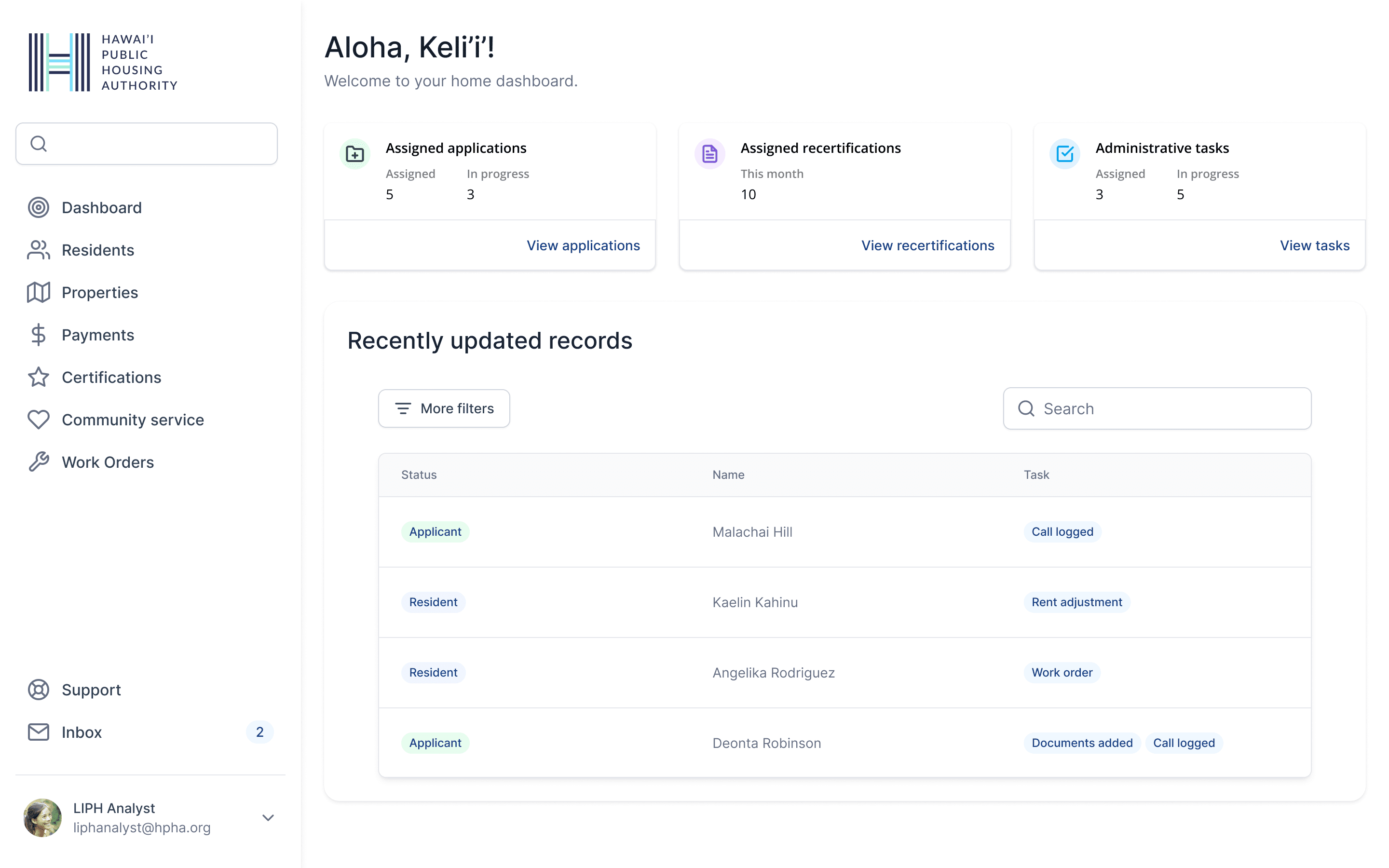
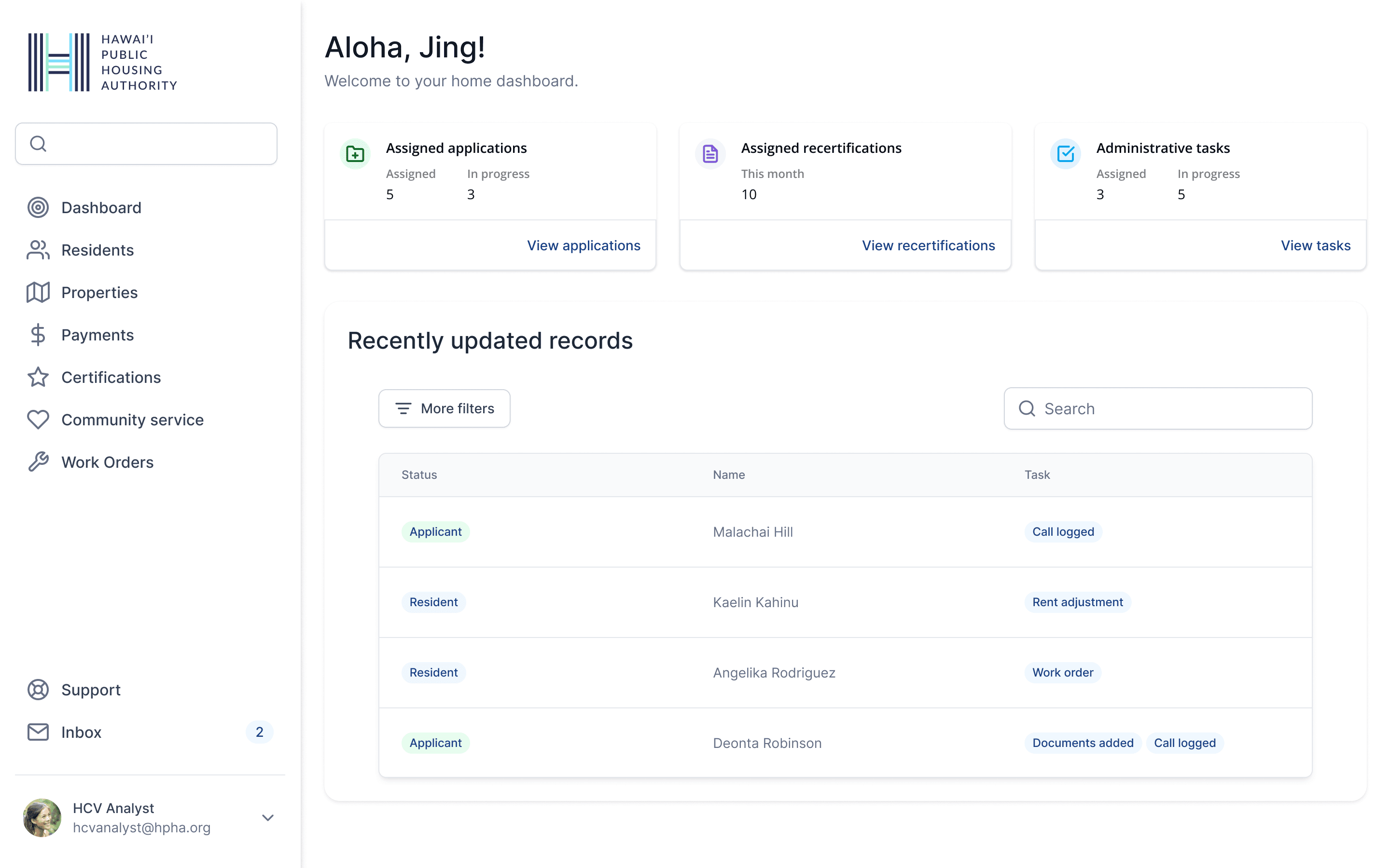
HPHA admin dashboard
HPHA admin dashboard
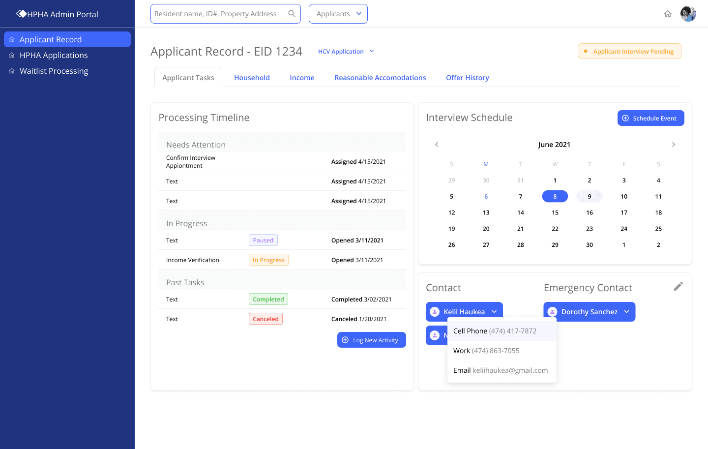


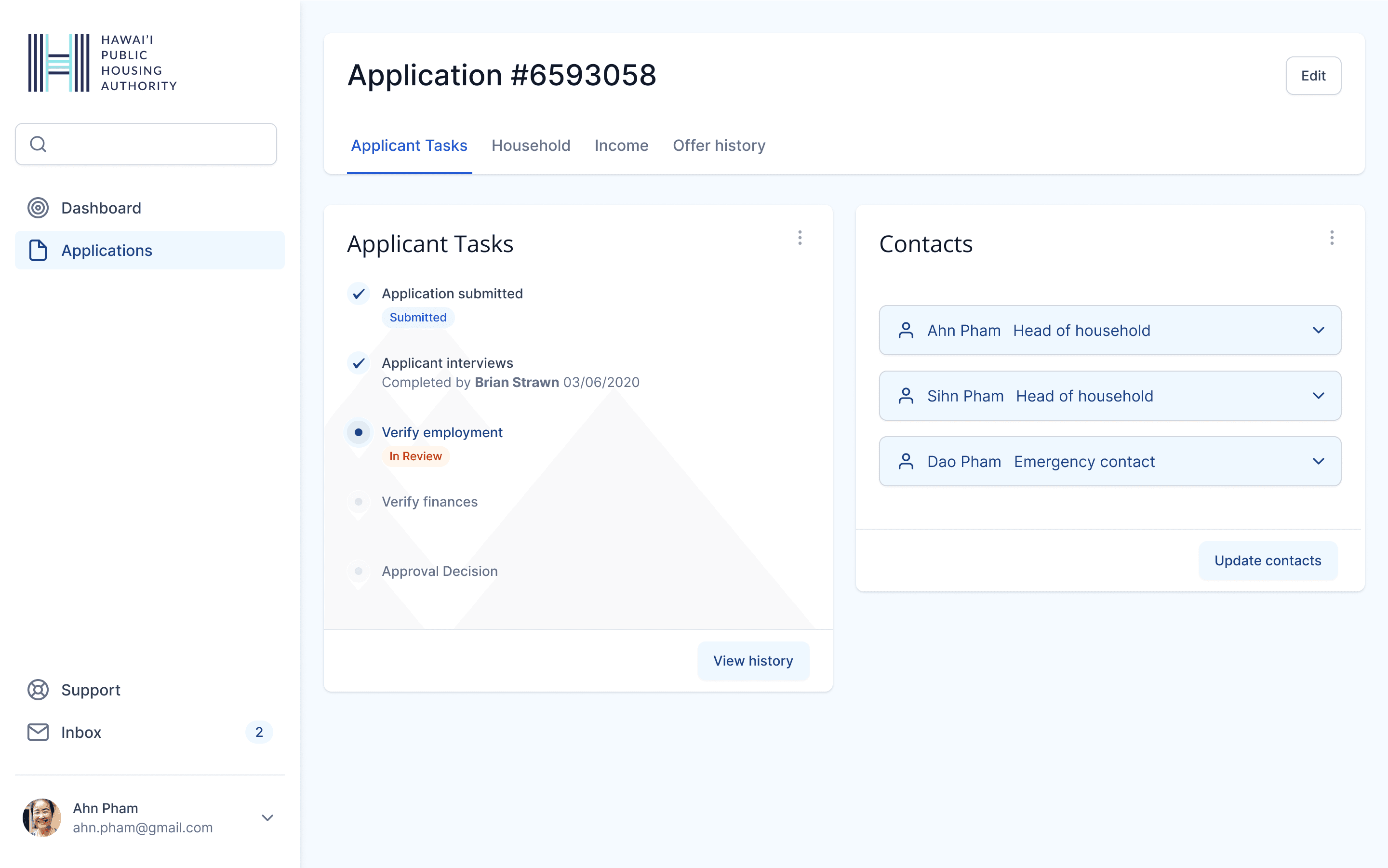
Applicant record - applicant tasks
Applicant record - applicant tasks
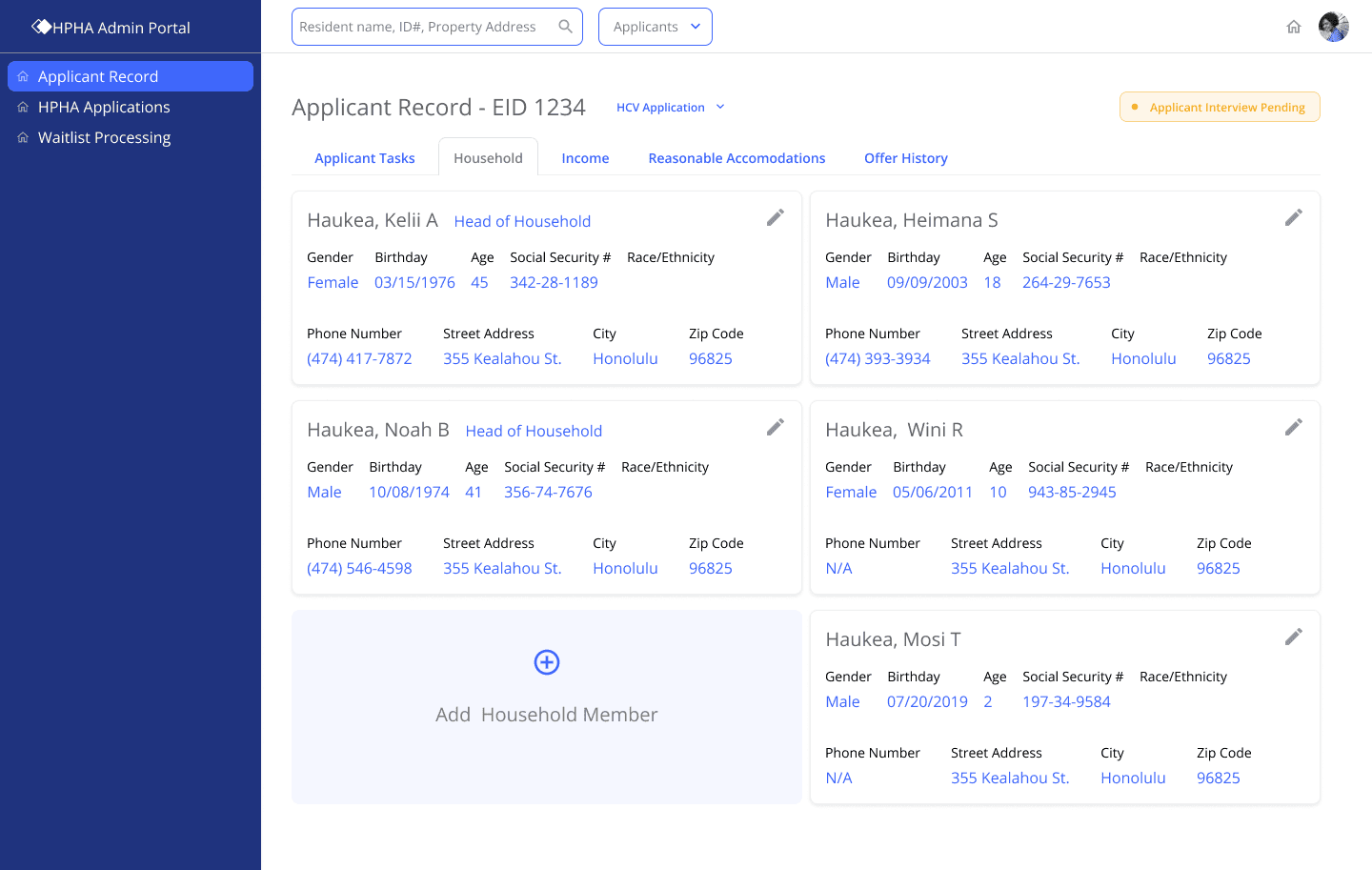


Applicant record - household
Applicant record - household
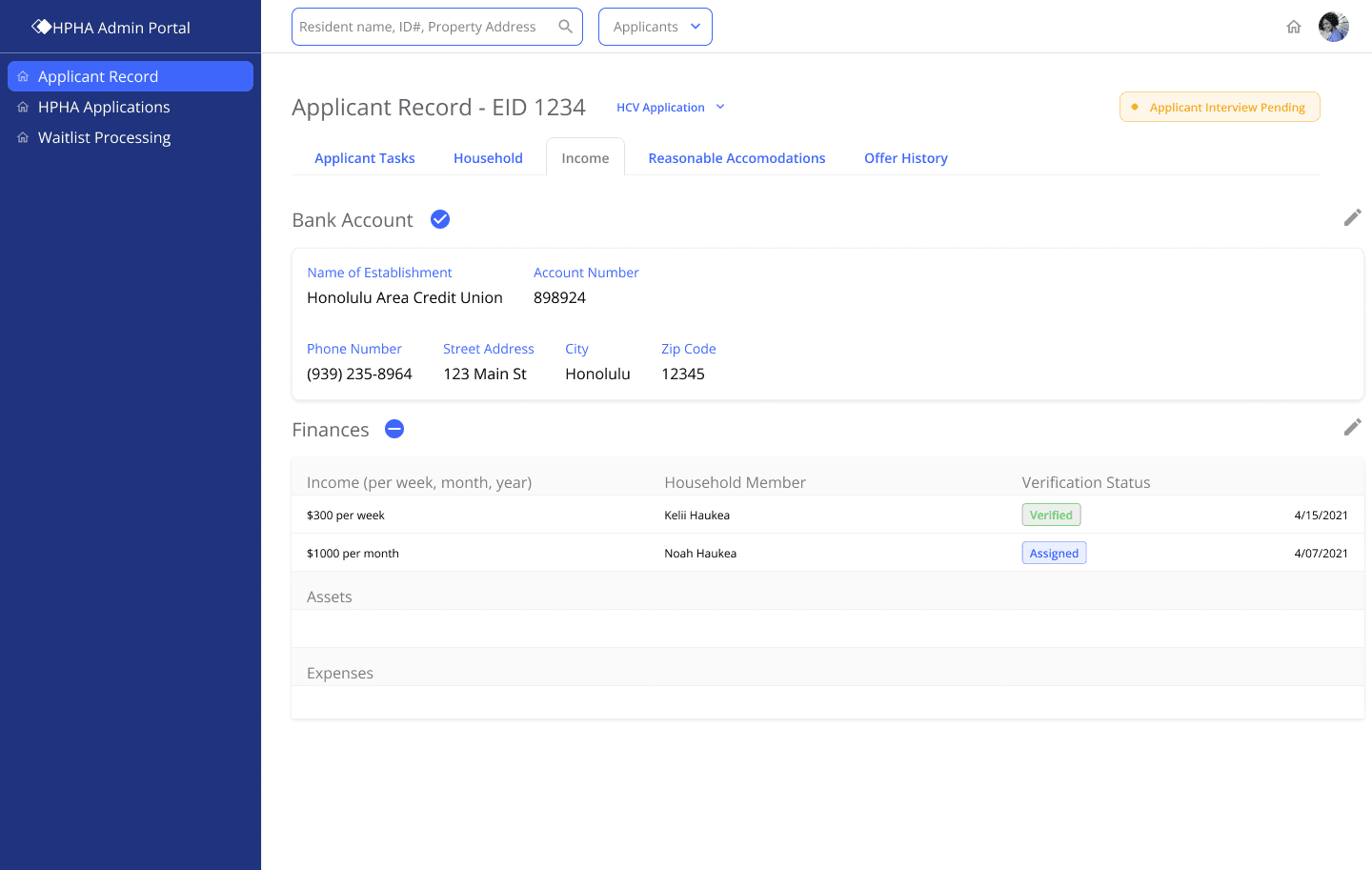


Applicant processing - income
Applicant processing - income
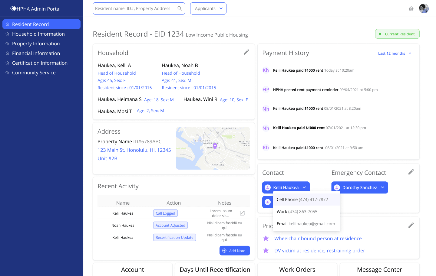


Resident record
Resident record
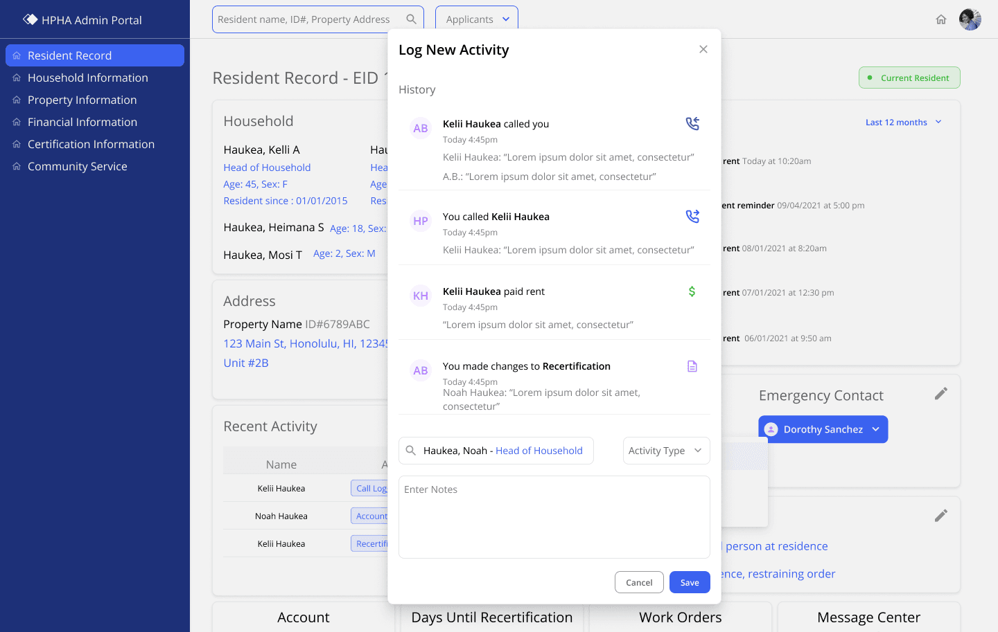


Resident record household info call/activity log
Resident record household info call/activity log
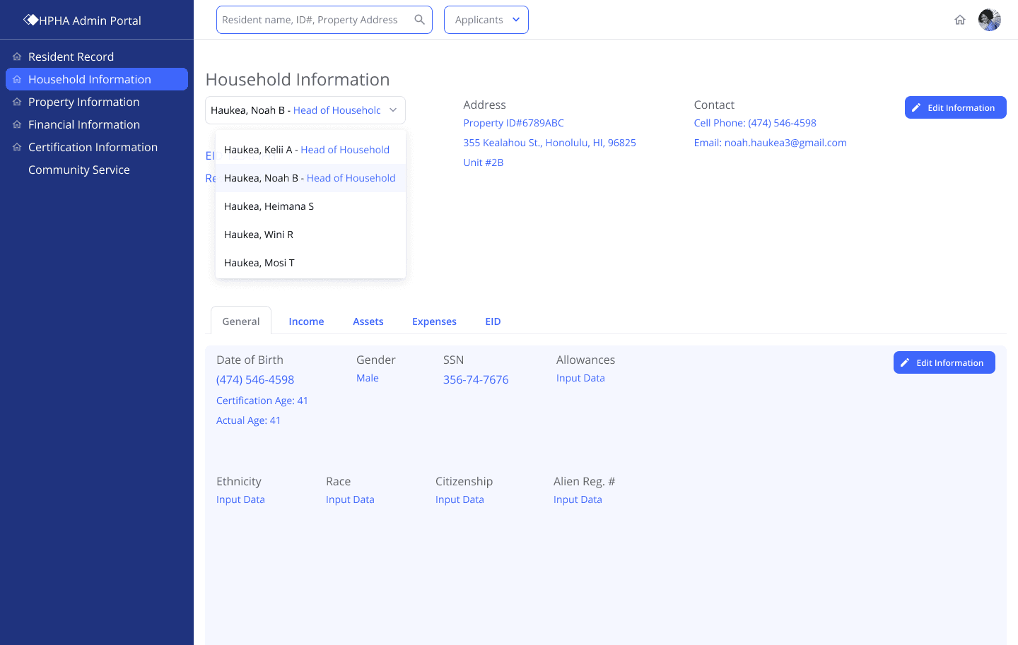


Resident record household information
Resident record household information
Outcome
Outcome
Outcome
We fully recognized that there was more to this problem than just a UI overhaul of the current experience for the HPHA team. This required us to first dive deep into their system, and explore designs to that depth. However, for the final RFP, this kind of depth was not necessarily needed. The final RFP document that was created was rich with research and even explored a new online application that was an exercise in equal parts design and user research.
The final RFP package was carefully crafted by the project lead and researcher to clearly package and communicate the months of work and research that went into this project. They were able to provide me with a very specific list of screens that they needed for this document, and I, in turn, brought those designs to a high-fidelity level of polish.
